Yamaha Updates Corporate Logo to Celebrate 70 Years of Innovation

Yamaha’s New Logo
A New Look for a Milestone Year
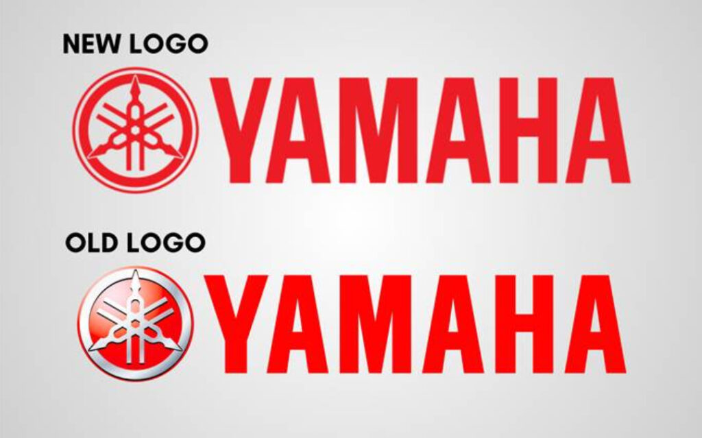
Yamaha Motor Co. has announced a significant update to its corporate logo, marking the first redesign in 27 years. The change coincides with Yamaha’s 70th anniversary, a milestone that reflects its rich legacy since its founding in 1955.
You may like it: TVS Ronin Café Racer: A Stunning Modified Marvel
Details of Yamaha’s New Logo
The updated logo has been tailored for the digital age, featuring a sleek, flat (2D) rendition of Yamaha’s iconic Tuning Fork Mark. The new design enhances visibility and adaptability across various digital platforms. Yamaha will gradually implement the new logo starting this month, signaling a fresh chapter for the company.
You may like it: Honda Activa e and QC1 EVs Open for Booking
Celebrating 70 Years with a Special Logo
In addition to its corporate redesign, Yamaha has created a special logo to commemorate its 70th anniversary. This design, inspired by racing number plates from the company’s inaugural motorcycle races, embodies the theme “Everything Begins with a Challenge.” Throughout the year, the 70th-anniversary logo will feature prominently at events, in marketing materials, and on corporate items to celebrate this historic occasion with employees, partners, and customers.

Yamaha’s New Logo
The Significance of Yamaha’s Tuning Fork Mark
At the heart of Yamaha’s identity is its Tuning Fork Mark, a symbol rooted in sound and harmony. A tuning fork, invented by trumpet player John Shore in the 17th century, is a tool for tuning musical instruments by creating a standard pitch. Yamaha’s logo features three tuning forks, representing:
- The synergy of technology, production, and sales: These pillars define Yamaha’s success and innovation.
- Musical elements of melody, harmony, and rhythm: Reflecting Yamaha’s global impact on sound and music.
- The enclosing circle: Signifying vitality and unity in its endeavors.
A Vision for the Future
As Yamaha Motor embarks on this new chapter, the updated logo and anniversary celebrations reaffirm its commitment to innovation and excellence. The changes not only honor Yamaha’s heritage but also position the brand for continued success in an increasingly digital and interconnected world.
The redesigned logo and the special 70th-anniversary emblem are more than just aesthetic updates—they’re a testament to Yamaha’s enduring spirit of challenge and its pursuit of harmony between tradition and modernity.
Yamaha Updates Corporate Logo to Celebrate 70 Years of Innovation

Yamaha’s New Logo
A New Look for a Milestone Year
Yamaha Motor Co. has announced a significant update to its corporate logo, marking the first redesign in 27 years. The change coincides with Yamaha’s 70th anniversary, a milestone that reflects its rich legacy since its founding in 1955.
You may like it: TVS Ronin Café Racer: A Stunning Modified Marvel
Details of Yamaha’s New Logo
The updated logo has been tailored for the digital age, featuring a sleek, flat (2D) rendition of Yamaha’s iconic Tuning Fork Mark. The new design enhances visibility and adaptability across various digital platforms. Yamaha will gradually implement the new logo starting this month, signaling a fresh chapter for the company.
You may like it: Honda Activa e and QC1 EVs Open for Booking
Celebrating 70 Years with a Special Logo
In addition to its corporate redesign, Yamaha has created a special logo to commemorate its 70th anniversary. This design, inspired by racing number plates from the company’s inaugural motorcycle races, embodies the theme “Everything Begins with a Challenge.” Throughout the year, the 70th-anniversary logo will feature prominently at events, in marketing materials, and on corporate items to celebrate this historic occasion with employees, partners, and customers.

Yamaha’s New Logo
The Significance of Yamaha’s Tuning Fork Mark
At the heart of Yamaha’s identity is its Tuning Fork Mark, a symbol rooted in sound and harmony. A tuning fork, invented by trumpet player John Shore in the 17th century, is a tool for tuning musical instruments by creating a standard pitch. Yamaha’s logo features three tuning forks, representing:
- The synergy of technology, production, and sales: These pillars define Yamaha’s success and innovation.
- Musical elements of melody, harmony, and rhythm: Reflecting Yamaha’s global impact on sound and music.
- The enclosing circle: Signifying vitality and unity in its endeavors.
A Vision for the Future
As Yamaha Motor embarks on this new chapter, the updated logo and anniversary celebrations reaffirm its commitment to innovation and excellence. The changes not only honor Yamaha’s heritage but also position the brand for continued success in an increasingly digital and interconnected world.
The redesigned logo and the special 70th-anniversary emblem are more than just aesthetic updates—they’re a testament to Yamaha’s enduring spirit of challenge and its pursuit of harmony between tradition and modernity.


